emmanuel.O — Design system
One system, every page.
Every page on this site is built from these parts. Colour, type, space and motion are tokens, so one change carries through everywhere.
01 — Colour
Two themes, one accent.
Warm neutrals in dark and light, and a red-orange used sparingly. The accent is darkened in the light theme and lifted in the dark one, so even small text passes AA.
Dark
- bgThe page#0a0a0a
- surfaceLoop frames and specimen sheets#141414
- inkText and solid buttons#f2f0eb
- mutedSecondary text and meta#a3a09a
- ruleHairlines and borders#262626
- accentLabel numbers, the accent word, focus and one call to action#f0461c
- on-accentText on the accent#0a0a0a
Light
- bgThe page#f5f3ee
- surfaceLoop frames and specimen sheets#edeae3
- inkText and solid buttons#111110
- mutedSecondary text and meta#5e5b55
- ruleHairlines and borders#dad6cc
- accentLabel numbers, the accent word, focus and one call to action#c42803
- on-accentText on the accent#f5f3ee
| Text | On | Dark | Light |
|---|---|---|---|
| Ink | Bg | 17.4:1 AAA | 17.0:1 AAA |
| Ink | Surface | 16.2:1 AAA | 15.7:1 AAA |
| Muted | Bg | 7.6:1 AAA | 6.1:1 AA |
| Muted | Surface | 7.1:1 AAA | 5.6:1 AA |
| Accent | Bg | 5.3:1 AA | 5.2:1 AA |
| Accent | Surface | 4.9:1 AA | 4.8:1 AA |
| On accent | Accent | 5.3:1 AA | 5.2:1 AA |
02 — Type
A grotesk that shouts, a sans that reads.
Clash Display carries headlines and numbers, DM Sans carries reading, DM Mono labels everything. Every size is fluid, from phone to wide screen.
Display XL
- 56–160px
- Leading 0.9
- Tracking −0.03em
- Clash Display 600
Design that ships.
Display
- 44–96px
- Leading 0.92
- Tracking −0.03em
- Clash Display 600
Selected work
H1
- 36–64px
- Leading 1
- Tracking −0.025em
- Clash Display 600
A designer who ships.
H2
- 28–44px
- Leading 1.05
- Tracking −0.02em
- Clash Display 500
Have a product worth building?
H3
- 22–28px
- Leading 1.15
- Tracking −0.01em
- Clash Display 500
Decisions made and why
Lead
- 20–24px
- Leading 1.45
- Tracking −0.005em
- DM Sans
I design and build products with teams anywhere.
Body
- 17–18px
- Leading 1.6
- Tracking 0em
- DM Sans
Every page on this site is built from the same small set of parts, so one change carries through everywhere.
Small
- 15–16px
- Leading 1.5
- Tracking 0em
- DM Sans
Captions, meta and secondary notes.
Label
- 13px
- Leading 1.4
- Tracking 0.04em
- DM Mono
02 — Selected work
Clash Display
Headlines and big numbers. 500, 600.
ABCDEFGHIJKLMNOPQRSTUVWXYZ abcdefghijklmnopqrstuvwxyz 0123456789 & — £€
DM Sans
Body and interface. Variable, 100–1000.
ABCDEFGHIJKLMNOPQRSTUVWXYZ abcdefghijklmnopqrstuvwxyz 0123456789 & — £€
DM Mono
Labels, meta and code. 400, 500.
ABCDEFGHIJKLMNOPQRSTUVWXYZ abcdefghijklmnopqrstuvwxyz 0123456789 & — £€
DM Serif Display
One accent word in a headline. Italic.
ABCDEFGHIJKLMNOPQRSTUVWXYZ abcdefghijklmnopqrstuvwxyz 0123456789 & — £€
Display with an Accent word
Design that ships.
Heading
Decisions made and why
Lead
I design and build products with teams anywhere.
Body
Plain, warm and confident. Short sentences. Reading text never runs wider than 64 characters, and the line height stays at 1.6.
Label
02 — Selected work
03 — Layout
Twelve columns and a lot of air.
Every edge lines up with a 12-column grid. Margins and gutters widen with the screen, and space does the work that boxes and shadows do elsewhere.
- Columns
- 12 at every width
- Margins
- 16–64px
- Gutters
- 16–24px
- Page width
- Up to 1600px
- Rules
- 1px hairlines, never shadows
- Corners
- Square. Pills only for chips and the theme toggle
Press G on any page to lay the grid over it.
- 4px
- 8px
- 12px
- 16px
- 24px
- 32px
- 48px
- 64px
- 96px
- 128px
- 160px
- 224px
- Between sections
- 96–192px, phone to wide screen
- Heading to its text
- 24–32px
- Above and below media
- 48–64px
- Reading width
- 64 characters at most
04 — Components
Few parts, every state.
Buttons, chips, tags and keys, shown at rest, hovered, focused, pressed and disabled. Focus is always a 2px accent ring with a 3px gap.
Solid
- Default
- Hover
- Focus
- Active
- Disabled
Solid, accent
- Default
- Hover
- Focus
- Active
- Disabled
Outline
- Default
- Hover
- Focus
- Active
- Disabled
Text link
- Default
- Hover
- Focus
- Active
- Disabled
- Default
- Hover
- Focus
- Selected
- Disabled
Filter the work by type
- Live
- Shipped
- Concept
- In progress
- In development
G Grid overlayCtrlK Key combinationEsc Close
02 — Selected work
A section: the label on the left, the content from column five.
05 — Media
Loops that earn their bytes.
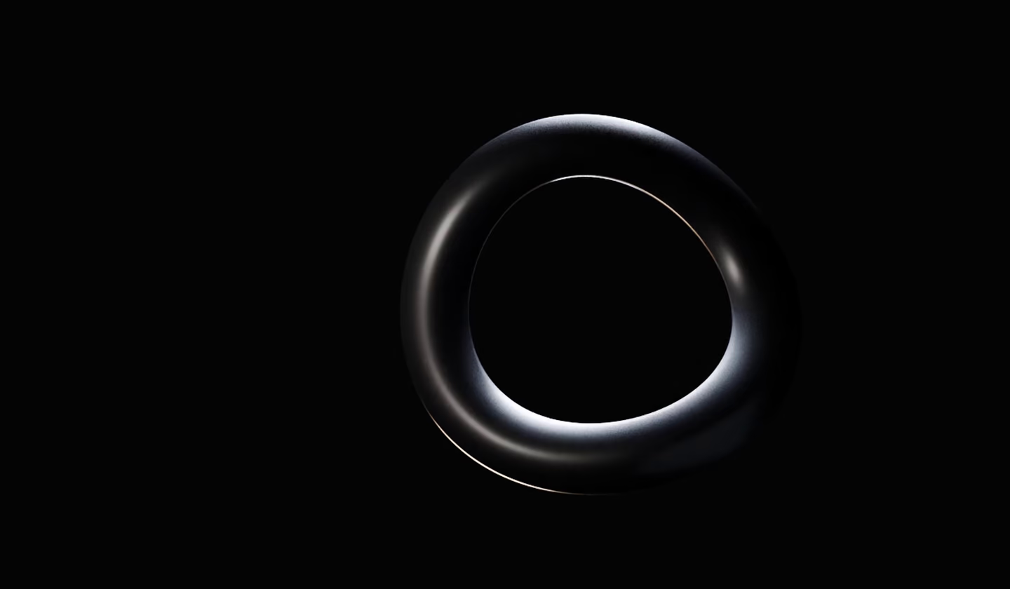
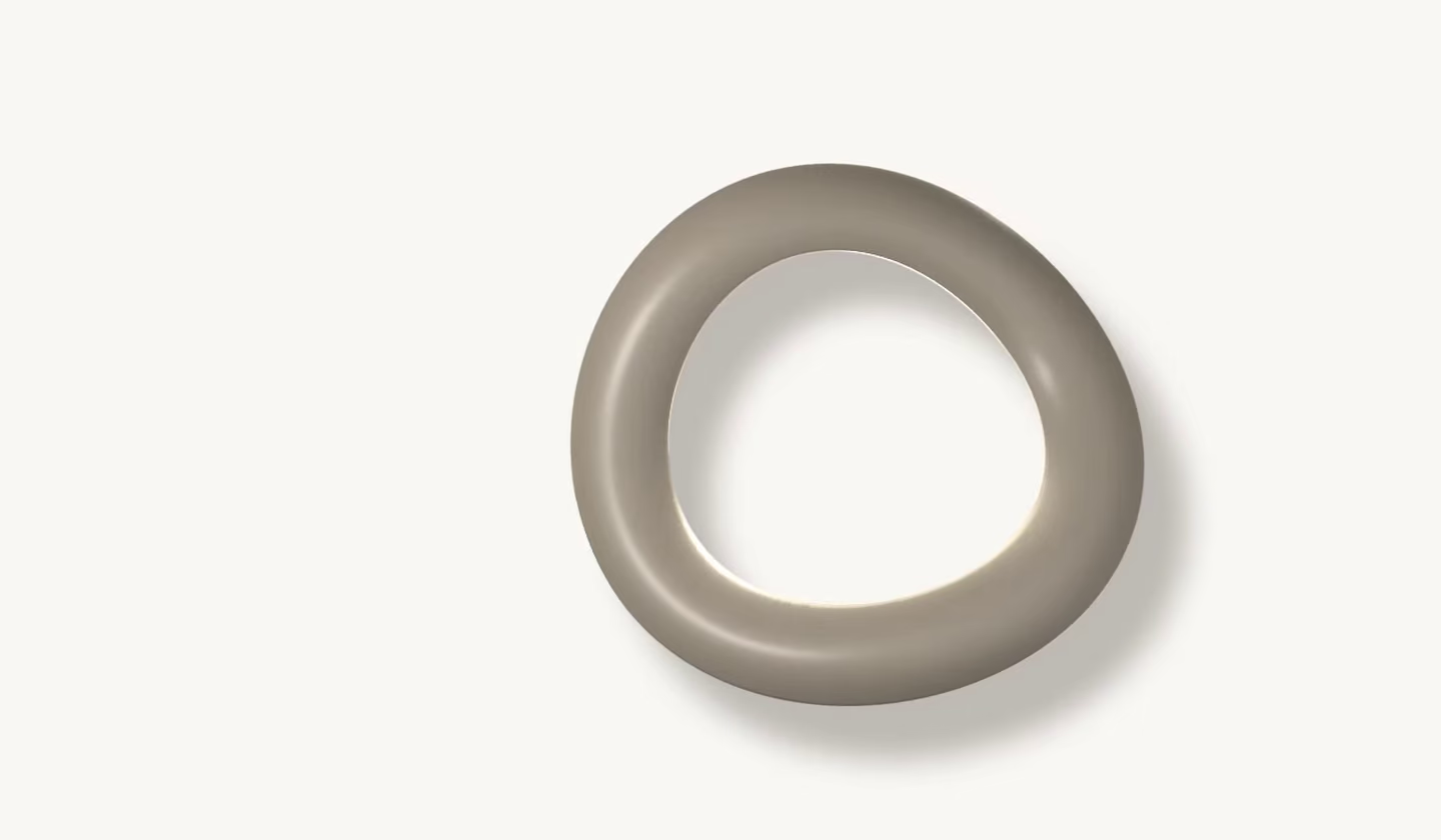
Work is shown moving, not as screenshots. Every loop follows the same rules, enforced by one small script that controls all of them.
The rules
- 01Poster first: a real frame as AVIF or WebP, never blank.
- 02Never preloads. It starts buffering just before it scrolls into view.
- 03Plays once at least half of it is on screen; pauses off screen and in background tabs.
- 04No more than two loops play at once.
- 05Every loop has a pause button.
- 06Reduced motion, Save-Data or a slow connection: the poster only, with a play button.
- 07Silent. 6 to 12 seconds in cards, up to 20 in case studies.
- 08Two widths, 960 and 1600px, each as WebM and MP4.
- 09Decorative in cards, where the link names the project; captioned in case studies.
- 10Loops with dark and light versions switch with the theme.


06 — Motion
Calm, quick, and only once.
Four durations and two easings for everything. Reveals play once and never in the first screen. With reduced motion nothing moves: content is simply there. Lines stagger by 80ms.
160ms --dur-quick
Hover, press and colour changes
320ms --dur-base
Underlines, fades and toasts
640ms --dur-slow
Panels and larger moves
960ms --dur-slower
Reveals
Ease out
Entrances
cubic-bezier(0.22, 1, 0.36, 1)
Ease in-out
Movement
cubic-bezier(0.65, 0, 0.35, 1)
Spring
The theme toggle only
cubic-bezier(0.34, 1.3, 0.5, 1)
Lines
Lines rise into place, one after another.
Wipe